
Introduction
Imagine spending hours creating the perfect design for your business card, brochure, product packaging, or company flyer. On your computer screen, every color looks vibrant, sharp, and exactly the way you envisioned it. But when the printed copies arrive, the colors appear dull, darker, or completely different from what you expected.
If you’ve ever experienced this, you’re certainly not alone.
One of the most common mistakes in graphic design and commercial printing is using the wrong color mode. Many people assume that the colors displayed on a computer monitor will look identical once printed on paper. Unfortunately, that’s not how color reproduction works.
Digital screens and printers create colors using two completely different systems.
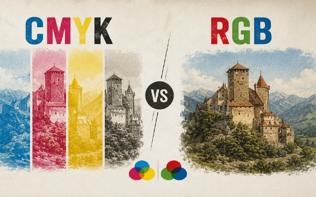
Electronic devices such as computers, smartphones, tablets, televisions, and digital billboards display colors using the RGB (Red, Green, Blue) color model. Professional printers, on the other hand, reproduce colors using the CMYK (Cyan, Magenta, Yellow, Black) color model.
Because these two color systems work differently, the same design can produce noticeably different results depending on where it is viewed.
Whether you’re a graphic designer, marketing professional, business owner, photographer, or simply preparing artwork for printing, understanding the difference between CMYK and RGB is essential. Choosing the correct color mode before designing can save time, reduce printing errors, avoid unexpected color shifts, and ensure your final printed materials look exactly as intended.
In this complete guide, you’ll learn everything you need to know about CMYK and RGB, including how they work, their advantages and limitations, when to use each one, why colors change during printing, and how to prepare print-ready files for professional-quality results.
By the end of this article, you’ll have the knowledge to confidently choose the right color mode for every project—whether it’s for digital media or high-quality commercial printing.
What You’ll Learn in This Guide
- What is RGB?
- What is CMYK?
- How RGB and CMYK create colors
- CMYK vs RGB: Key Differences
- Why printed colors look different from your screen
- When to use RGB and when to use CMYK
- How to convert RGB to CMYK correctly
- Common mistakes to avoid before printing
- Frequently Asked Questions (FAQ)
What is RGB?
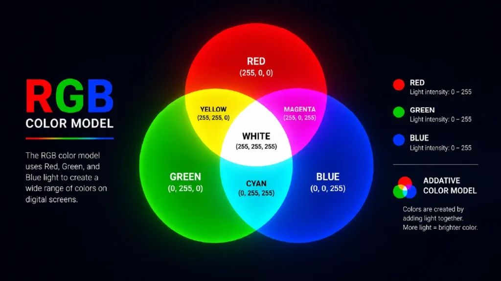
RGB stands for Red, Green, and Blue—the three primary colors of light used to create millions of colors on digital screens. Unlike printed materials, which rely on ink, digital devices produce colors by emitting light. This system is known as the Additive Color Model, where colors become brighter as more light is added.
Every screen you use today—whether it’s a smartphone, laptop, television, tablet, or LED display—creates images using RGB. Tiny pixels on the screen contain red, green, and blue sub-pixels. By adjusting the brightness of these three colors, the screen can display over 16 million different color combinations.
For example, when all three colors (Red, Green, and Blue) are displayed at their maximum intensity, the result is white. When all three are turned off, the screen appears black. Every other color you see is created by mixing different intensities of these three primary colors.
This is why RGB is considered the standard color mode for all digital content.
How RGB Works
RGB follows the principle of light mixing rather than ink mixing.
Imagine shining three colored flashlights—one red, one green, and one blue—onto the same white wall. As the lights overlap, they create entirely new colors.
For example:
- Red + Green = Yellow
- Green + Blue = Cyan
- Blue + Red = Magenta
- Red + Green + Blue = White
This ability to combine light makes RGB capable of producing extremely bright, vivid, and saturated colors that look stunning on digital displays.
Where is RGB Used?
RGB is designed specifically for digital media. If your design will only be viewed on a screen, RGB is the correct choice.
Common examples include:
- Websites
- Mobile Apps
- Social Media Graphics
- YouTube Thumbnails
- Digital Advertisements
- Email Newsletters
- Presentation Slides
- LED Displays
- Television Screens
- Computer Monitors
If your artwork is never intended to be printed, RGB provides the widest range of vibrant colors.
Advantages of RGB
RGB offers several benefits for digital design:
- Produces brighter and more vibrant colors.
- Supports a much wider color gamut than print.
- Perfect for websites and social media graphics.
- Compatible with virtually all digital devices.
- Ideal for photography, UI/UX design, and video content.
The Biggest Limitation of RGB
Although RGB creates beautiful colors on screens, it is not suitable for commercial printing.
Professional printers use ink instead of light, which means they cannot reproduce every color available in the RGB color space. As a result, highly saturated blues, greens, oranges, and neon colors often appear duller when printed.
This is one of the main reasons why designers should convert print-ready artwork to CMYK before sending files to a printing company.
What is CMYK?
CMYK stands for Cyan, Magenta, Yellow, and Key (Black). It is the standard color model used in commercial printing to reproduce full-color images on paper and other printable materials.
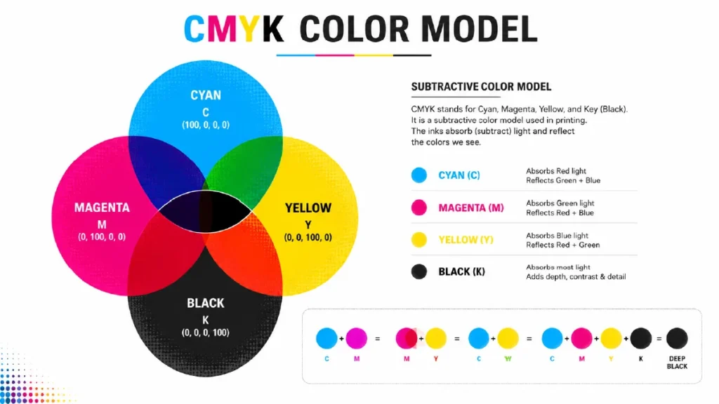
Unlike RGB, which creates colors by emitting light, CMYK creates colors by applying layers of colored ink onto a white surface. This process is known as the Subtractive Color Model because each layer of ink absorbs (subtracts) certain wavelengths of light while reflecting the remaining colors that we see.
For example, a white sheet of paper reflects nearly all visible light. When cyan ink is applied, it absorbs red light and reflects green and blue. Magenta absorbs green light, while yellow absorbs blue light. By combining these three inks in different percentages, printers can reproduce thousands of colors.
Although mixing Cyan, Magenta, and Yellow theoretically produces black, the result is usually a muddy dark brown rather than a true black. To achieve deeper shadows, sharper text, and better contrast, the printing industry adds a fourth ink—Key (Black). This is why the color model is called CMYK instead of simply CMY.
Today, almost every professional printing project relies on CMYK, including:
- Business Cards
- Brochures
- Flyers
- Posters
- Packaging Boxes
- Paper Bags
- Books
- Catalogs
- Stickers
- Labels
- Magazines
- Corporate Stationery
If your design will be printed, CMYK should always be your starting point. Designing directly in CMYK helps ensure that the colors you see during the design process are much closer to the final printed result.
How CMYK Works
A commercial printer doesn’t print every color separately. Instead, it prints tiny halftone dots of Cyan, Magenta, Yellow, and Black ink. These microscopic dots overlap in different patterns and densities, creating the illusion of continuous colors.
For example:
- Cyan + Yellow = Green
- Magenta + Yellow = Red
- Cyan + Magenta = Blue
- Cyan + Magenta + Yellow + Black = Deep, rich colors with strong contrast
This layering technique allows modern printing presses to reproduce photographs, illustrations, and complex graphics with remarkable accuracy.
Why CMYK Is Essential for Professional Printing
Most printing presses, digital printers, and offset presses are calibrated to work in the CMYK color space. If you submit artwork in RGB, the printer must automatically convert it to CMYK before printing.
During this conversion, some bright digital colors—especially neon shades, vivid blues, and highly saturated greens—cannot be reproduced exactly because they fall outside the printable CMYK color gamut.
For this reason, professional designers always prepare print-ready files in CMYK to minimize unexpected color shifts and achieve more predictable results.
CMYK vs RGB: What’s the Difference?
Now that you understand how RGB creates colors on digital screens and how CMYK reproduces colors using ink, it’s time to compare them side by side.
Although both color models are designed to produce millions of colors, they serve completely different purposes. Choosing the wrong color mode can lead to disappointing print results, inaccurate colors, and unnecessary production costs.
The easiest way to understand the difference is to remember one simple rule:
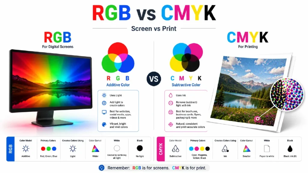
RGB is designed for screens, while CMYK is designed for printing.
However, there’s much more to the story.
CMYK vs RGB Comparison
| Feature | RGB | CMYK |
|---|---|---|
| Full Name | Red, Green, Blue | Cyan, Magenta, Yellow, Black |
| Color System | Additive Color Model | Subtractive Color Model |
| Creates Colors Using | Light | Ink |
| Primary Use | Digital Displays | Commercial Printing |
| Color Gamut | Wider | Smaller |
| Brightness | More Vibrant | More Natural |
| Best For | Websites, Social Media, Apps | Business Cards, Flyers, Packaging |
| White Color | Created by combining all light | Paper itself is white |
| Black Color | No light | Black ink (K) |
RGB Uses Light, CMYK Uses Ink
The biggest difference between RGB and CMYK is how they create color.
RGB generates colors by adding light. Every pixel on your monitor contains tiny red, green, and blue light sources. As these lights combine, they create millions of vibrant colors.
CMYK works in the opposite way.
Instead of emitting light, printers place tiny layers of cyan, magenta, yellow, and black ink onto paper. These inks absorb certain wavelengths of light and reflect the remaining colors back to your eyes.
That’s why RGB is called an Additive Color Model, while CMYK is known as a Subtractive Color Model.
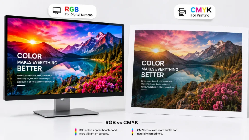
Why RGB Looks More Vibrant
Have you ever noticed that a design looks brighter on your monitor than it does after printing?
This happens because computer screens can display colors that simply cannot be reproduced with ink.
RGB has a much larger color gamut, allowing it to display highly saturated blues, neon greens, bright oranges, and vivid pinks.
CMYK has a smaller printable color range because it is limited by the physical properties of ink and paper.
As a result, some RGB colors must be adjusted during printing, making them appear softer or slightly duller.
Which Color Mode Should You Choose?
The answer depends entirely on where your design will be used.
Choose RGB if your project is intended for:
- Websites
- Social Media
- Mobile Apps
- Videos
- Digital Advertisements
- Email Campaigns
- Presentation Slides
Choose CMYK if your design will be printed as:
- Business Cards
- Flyers
- Brochures
- Posters
- Packaging Boxes
- Labels
- Paper Bags
- Books
- Catalogs
- Corporate Stationery
Using the correct color mode from the beginning will save time, reduce color correction, and ensure more predictable results.
Pro Tip
Before sending your artwork to a printing company, always check that your document is created in CMYK instead of RGB. This simple step can prevent unexpected color shifts and help your printed materials look as close as possible to your original design.
Why Do Printed Colors Look Different from Your Screen?
Have you ever approved a design on your computer, only to be disappointed when the printed version looked darker, duller, or slightly different?
This is one of the most common concerns in graphic design and commercial printing. Fortunately, it’s not a printing error in most cases—it’s simply the result of how digital screens and printers reproduce color.
A computer monitor creates colors by emitting light using the RGB color model, while a printer reproduces colors by applying CMYK inks onto paper. Because light and ink behave differently, the same design can appear different across digital and printed media.
1. RGB Has a Larger Color Gamut
One of the biggest reasons for color differences is the color gamut.
A color gamut is the range of colors that a system can reproduce.
RGB has a much wider color gamut than CMYK, allowing it to display extremely bright, vibrant, and saturated colors—especially neon greens, electric blues, vivid oranges, and fluorescent pinks.
CMYK cannot reproduce many of these highly saturated colors because ink has physical limitations.
When an RGB design is converted to CMYK, any colors that fall outside the printable color range are automatically adjusted to the closest printable match. As a result, some colors may appear less vibrant in print.
2. Screens Emit Light, Paper Reflects Light
Another important difference is how colors are viewed.
A computer monitor is a light source. It shines red, green, and blue light directly into your eyes, making colors appear brighter and more vivid.
Printed paper does not emit light.
Instead, it reflects the surrounding light in the room. The quality of that light—whether natural daylight, office lighting, or warm indoor lighting—can significantly affect how printed colors appear.
This is why the same printed brochure may look slightly different under different lighting conditions.
3. Paper Type Also Affects Color
The type of paper you choose has a noticeable impact on color reproduction.
For example:
- Glossy paper produces brighter and more saturated colors.
- Matte paper creates a softer, less reflective appearance.
- Uncoated paper absorbs more ink, making colors look slightly muted.
- Textured paper can reduce sharpness and color intensity.
Even when using the same printer and the same file, changing the paper stock can change the final appearance of the printed design.
4. Incorrect Color Mode
Many beginners design everything in RGB because it is the default setting in most design software.
If an RGB file is sent directly to a commercial printer, the printing software must automatically convert it to CMYK before printing.
This automatic conversion often produces unexpected color shifts.
For professional printing, it’s always recommended to design in CMYK from the beginning or convert your artwork before exporting the final print-ready PDF.
Professional Tip
To achieve the most accurate printed colors:
- Design in CMYK for all print projects.
- Use high-quality images with a resolution of 300 DPI.
- Export your artwork as a print-ready PDF.
- Request a printed proof before large production runs whenever color accuracy is critical.
Taking these simple steps can save time, reduce costly reprints, and ensure your final printed materials match your expectations as closely as possible.
When Should You Use RGB and When Should You Use CMYK?
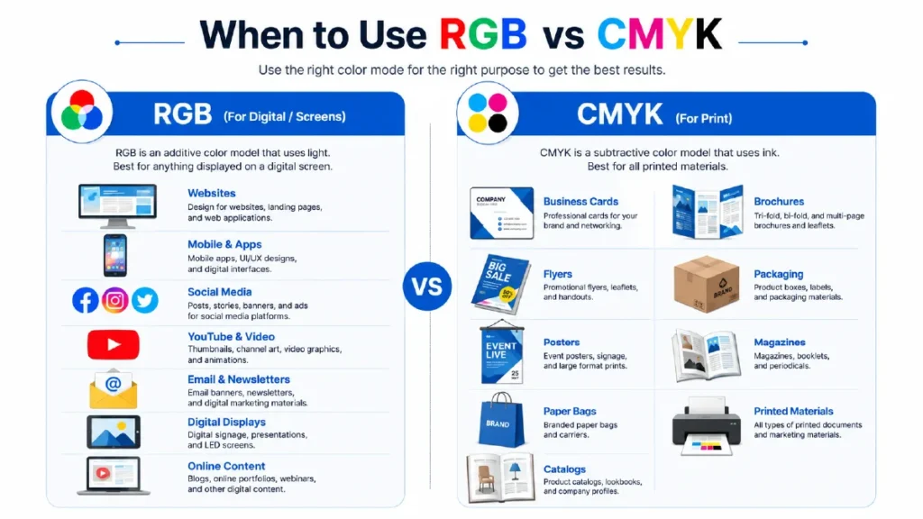
Choosing the right color mode is just as important as creating a great design. Even a professionally designed artwork can produce disappointing results if it’s created in the wrong color mode.
A simple rule can help you avoid most color-related problems:
If your design will be viewed on a screen, use RGB. If it will be printed, use CMYK.
Although this rule sounds straightforward, many designers and business owners accidentally create print files in RGB. As a result, the colors often change during printing because the printer must convert the file to CMYK automatically.
Knowing when to use each color mode will help you achieve consistent and professional results.
Use RGB for Digital Projects
RGB is the best choice for anything that will be displayed on an electronic screen. Since monitors, smartphones, tablets, and televisions all use RGB light, this color mode produces the brightest and most vibrant colors.
Use RGB for:
- Websites
- Social Media Graphics
- Facebook & Instagram Posts
- YouTube Thumbnails
- Digital Advertisements
- Mobile Apps
- Presentation Slides
- Email Newsletters
- Digital Signage
- Online Portfolios
If your audience will only see the design on a screen, RGB is the ideal choice.
Use CMYK for Printed Materials
CMYK should always be used for designs that will be printed.
Commercial printers use cyan, magenta, yellow, and black inks to reproduce colors on paper. Designing in CMYK helps ensure that the printed result closely matches your expectations.
Use CMYK for:
- Business Cards
- Flyers
- Brochures
- Posters
- Packaging Boxes
- Paper Bags
- Stickers & Labels
- Books & Magazines
- Catalogs
- Letterheads
- Envelopes
- Corporate Stationery
If your design is going to a printing press, CMYK is the correct choice.
Quick Decision Guide
| Project | Recommended Color Mode |
|---|---|
| Website | RGB |
| Social Media Post | RGB |
| Mobile App | RGB |
| YouTube Thumbnail | RGB |
| Email Banner | RGB |
| Business Card | CMYK |
| Flyer | CMYK |
| Brochure | CMYK |
| Packaging | CMYK |
| Poster | CMYK |
| Book | CMYK |
| Magazine | CMYK |
What If Your Design Will Be Used for Both?
Sometimes the same design needs to appear both online and in print.
For example, a company may create a brochure for printing and also upload it as a PDF on its website.
In this case, it’s recommended to:
- Create the master design in CMYK for printing.
- Export a separate RGB version for digital use.
This approach ensures the best possible color accuracy across both print and digital platforms.
Best Practice
Before starting any new design project, ask yourself one simple question:
“Will this design be viewed on a screen or printed on paper?”
The answer will immediately tell you which color mode to use, helping you avoid unnecessary color corrections and costly printing mistakes.
How to Convert RGB to CMYK Without Losing Color Quality
Converting an RGB design to CMYK isn’t as simple as changing a setting. If done incorrectly, your artwork may lose color accuracy, appear dull, or produce unexpected results when printed.
The goal is not to make the colors identical—because RGB and CMYK have different color gamuts—but to ensure the printed version looks as close as possible to your original design.
Here are the best practices for converting RGB files to CMYK while maintaining professional print quality.
Convert to CMYK Before Sending Your File to Print
One of the biggest mistakes designers make is submitting RGB files directly to a printing company.
Although most commercial printers automatically convert RGB files to CMYK, the results may not match your expectations.
Instead, convert your artwork yourself so you can review and adjust the colors before printing.
Adobe Photoshop
Photoshop makes RGB to CMYK conversion simple.
Go to:
Image → Mode → CMYK Color
After converting, carefully inspect bright blues, greens, oranges, and reds. Some colors may appear less vibrant because they fall outside the printable CMYK color range.
If necessary, make manual color adjustments before exporting the final file.
Adobe Illustrator
If you’re designing logos, business cards, brochures, or packaging in Illustrator, it’s best to create your document in CMYK from the very beginning.
If your artwork is already in RGB:
File → Document Color Mode → CMYK Color
Illustrator will convert all colors to the CMYK color space.
Adobe InDesign
For magazines, books, catalogs, and multi-page documents, InDesign supports CMYK workflows throughout the design process.
When exporting your final file:
- Export as PDF (Print)
- Select the correct CMYK color profile
- Embed fonts
- Include bleed and crop marks if required
Canva Users
Canva primarily works in RGB because it’s designed for digital content.
If you’re creating artwork for professional printing:
- Use Canva Pro to export as PDF Print
- Enable crop marks and bleed
- Ask your printing company to review the file before production
For high-end commercial printing, Adobe Illustrator or InDesign generally provides better color control than Canva.
Export as a Print-Ready PDF
Once your design is complete, export it as a high-quality PDF instead of JPG or PNG.
A print-ready PDF preserves:
- Vector graphics
- Fonts
- Image quality
- CMYK color information
- Bleed settings
This is the preferred format for almost every professional printing company.
Professional Tips for Better Color Accuracy
Before sending your artwork to print:
- Design in CMYK whenever possible.
- Use high-resolution images (300 DPI).
- Avoid neon or overly saturated RGB colors.
- Soft-proof your artwork before exporting.
- Export as a print-ready PDF.
- Request a printed proof for important projects.
Following these simple steps can significantly reduce color differences and help you achieve more predictable, professional printing results.
Common CMYK and RGB Mistakes to Avoid
Even experienced designers sometimes make simple mistakes that can lead to poor print quality, unexpected color shifts, or costly reprints. Understanding these common errors will help you produce more accurate and professional results.
Here are the most common CMYK and RGB mistakes—and how to avoid them.
1. Designing Print Files in RGB
This is by far the most common mistake.
Many design programs default to RGB because they’re primarily built for digital content. If you create a brochure, business card, or flyer in RGB, the printing company will eventually convert it to CMYK.
Unfortunately, some bright colors may lose their vibrancy during the conversion.
Best Practice:
Always create print projects in CMYK from the beginning.
2. Expecting Printed Colors to Match Your Screen Exactly
Your monitor produces colors using light, while printed materials use ink on paper.
Because these technologies work differently, printed colors will almost never look 100% identical to what you see on your screen.
Best Practice:
Expect slight color variations and request a printed proof for important projects.
3. Using Low-Resolution Images
Color isn’t the only thing that affects print quality.
Using images downloaded from websites or social media often results in blurry or pixelated prints because they’re typically only 72 DPI.
Professional printing requires images with a resolution of 300 DPI or higher.
Best Practice:
Always use high-resolution images for print.
4. Ignoring Bleed and Safe Margins
Many first-time designers place text or graphics too close to the edge of the page.
During trimming, important elements can be cut off.
Best Practice:
- Add a 3 mm bleed around your artwork.
- Keep important text inside the safe margin.
5. Exporting the Wrong File Format
Sending JPG or PNG files for commercial printing can reduce quality and remove important print settings.
Most professional printers prefer:
- Print-ready PDF
- AI
- EPS
- High-quality TIFF (when required)
Best Practice:
Export your final artwork as a Print-Ready PDF with embedded fonts and bleed.
6. Using Rich Black Incorrectly
Not all black colors are the same.
For body text and small fonts, 100% Black (K) is usually recommended.
Using Rich Black for small text may cause slight registration issues, making text appear blurry.
Best Practice:
- Small Text → 100% K
- Large Solid Black Areas → Rich Black (recommended by your printer)
7. Skipping a Print Proof
Even perfectly designed files can produce unexpected results due to paper type, finishing, or printer calibration.
A printed proof allows you to catch problems before mass production.
Best Practice:
Always request a proof for large print orders or premium marketing materials.
Quick Checklist Before Printing
Before sending your artwork to a printing company, make sure you’ve completed this checklist:
- Document is in CMYK
- Images are 300 DPI
- Fonts are embedded or outlined
- Bleed is included
- Safe margins are respected
- File exported as a Print-Ready PDF
- Colors have been reviewed after RGB to CMYK conversion
- Print proof has been approved (if required)
Following this checklist can help you avoid the most common printing mistakes and ensure your final printed materials look professional, accurate, and ready for production.
Frequently Asked Questions (FAQs)
1. What is the main difference between RGB and CMYK?
The main difference is how they create colors. RGB (Red, Green, Blue) uses light and is designed for digital screens, while CMYK (Cyan, Magenta, Yellow, Black) uses ink and is the standard color model for professional printing.
2. Should I use RGB or CMYK for printing?
You should always use CMYK for printed materials such as business cards, brochures, flyers, posters, packaging, and catalogs. Designing in CMYK helps ensure the printed colors are as accurate as possible.
3. Why do printed colors look different from my screen?
Computer monitors display colors using light (RGB), while printers reproduce colors with ink (CMYK). Because RGB has a larger color gamut than CMYK, some bright colors cannot be reproduced exactly in print.
4. Can I print an RGB file?
Yes, but it’s not recommended.
Most printing companies automatically convert RGB files to CMYK before printing. This automatic conversion can change the appearance of certain colors, especially bright blues, greens, and neon shades.
5. Which file format is best for professional printing?
A Print-Ready PDF is the preferred format for commercial printing because it preserves fonts, vector graphics, image quality, bleed settings, and CMYK color information.
6. What image resolution is recommended for printing?
Professional printing requires images with a resolution of 300 DPI (Dots Per Inch) to ensure sharp and high-quality results.
7. Can I convert RGB to CMYK without changing colors?
Not completely.
Since RGB contains colors that CMYK cannot reproduce, some color changes are unavoidable. However, converting your artwork correctly and reviewing the colors before printing will minimize noticeable differences.
Conclusion
Understanding the difference between RGB and CMYK is essential for anyone creating artwork for digital media or professional printing.
While RGB delivers bright, vibrant colors for screens, CMYK is specifically designed to reproduce accurate colors using ink on paper. Choosing the correct color mode at the beginning of your project can help prevent unexpected color shifts, reduce costly printing errors, and ensure your final design looks exactly as intended.
Whether you’re designing a business card, brochure, product packaging, poster, or social media graphic, selecting the right color mode is one of the simplest ways to achieve professional-quality results.
By following the best practices covered in this guide—using CMYK for print, RGB for digital content, exporting print-ready PDFs, and checking your files before production—you’ll be well prepared for your next design project.
Need Professional Printing Services?
At GreenwayPrint, we help businesses, designers, and marketers achieve outstanding print quality with accurate color reproduction and premium finishing options.
Whether you need:
- Business Cards
- Brochures
- Flyers
- Packaging Boxes
- Paper Bags
- Stickers & Labels
- Books & Catalogs
- Large Format Printing
- Corporate Branding Materials
our experienced team is ready to help you bring your ideas to life with professional printing solutions.
Contact GreenwayPrint today for expert advice and high-quality printing services tailored to your business needs.